Go back to Projects

Budgety, an easy to use expense tracker

UX/UI Design

My last project was a mobile app for iOS, so my main goal with this project was to put my UX and UI design skills into practice and experiment with a new platform. Over the course of a few weeks I managed to go from an idea to the finished user interface of Budgety, an easy to use expense tracker for the web.

Defining the problem

One of the things I enjoy doing is keeping track of my expenses. I know is time consuming, but I really like being able to check how much I spent in coffee last month or how much I paid for something a while ago. Also, having a clear picture of where your money goes can have a huge impact in your finances.

The problem is that keeping track of your money is hard work, and that's why most people don't do it. We have plenty of tools to keep track of our money, but many of them are packed with features most users don't need, such as budgeting planners or credit monitoring tools, to name a few. Other alternatives even require you to connect your bank account, which some people don't like. This can make users lose interest or get tired over time, so they stop tracking their expenses.

I wanted to design a tool that you could use to keep track of your expenses in a simple way and easily short them out in different categories.

When I was looking for a new design project, I decided it would be fun to tackle this problem and focus on designing a really simple expense tracker for the web. The idea was to design a tool so easy to use that you won't need to spend time learning to use the app main features. I wanted to design a tool that you could use to keep track of your expenses in a simple way and easily short them out in different categories.

An app like that could be really useful for users that need to keep track of their money but don't feel like spending their time learning to use complicated software packed with features they won't ever use. While I'm sure we can agree those more advanced features I just mentioned are great for more demanding users, there's this other group of people that just need to keep track of their money in a simple and easy way.

The process

Now that I had a problem to solve, I was ready to start working on the user interface itself. Of course, I needed to come up with the app main features first, so after a little bit of brainstorming I decided Budgety should have the following features: the ability to add transactions, category shorting, a powerful search feature and a few graphs and widgets you could use to check your overall spending trends.

I always start my projects with pen and paper since I find it easier to experiment with different layouts way before opening Figma. After some sketching, I had a clear picture of the app basic layout and I was ready to start playing with pixels.

Building a great user experience

One of the most important things in product design is achieving a clear visual hierarchy. We have plenty of tools we can use in order to improve the interface hierarchy, such as white space (or negative space), color and contrast.

One of the most important things in product design is achieving a clear visual hierarchy.

On Budgety, I've tried to use enough white space to clearly separate different element groups and make the app breath. Contrast is also key to draw attention to the main components and help the user navigate the interface.

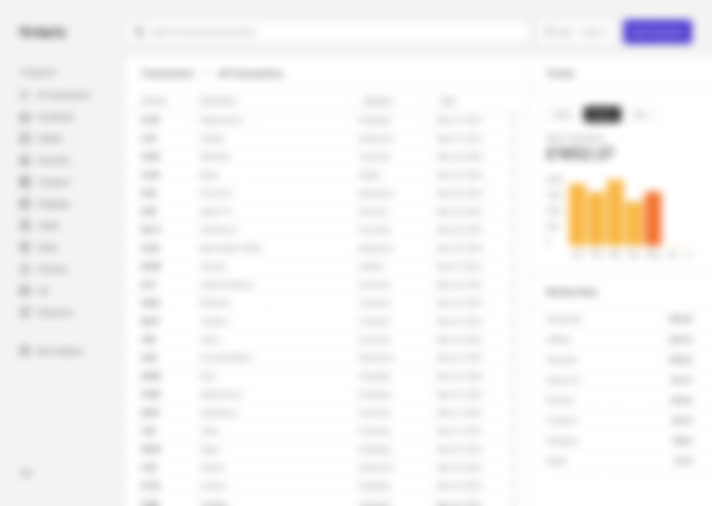
One of the most helpful techniques to check your interface hierarchy is the Squint test. This technique has proven really useful to offer a clear idea of which app elements stand out more. I tested that out by applying a blur layer on top of my design and you can clearly see that the app main action (adding a transaction) stands out really well. Also, it's easy to guess how the app layout is distributed even if you haven't seen the app before.

Screenshot showing how I applied a blured layer on top of Budgety's dashboard to use a technique known as the Squint Test.

Accessibility

Screenshot showing the Contrast plugin menu: there is a layer selected and the plugin says that it passes the WCAG levels

As designers, we shouldn't forget about accessibility. Of course, we have some great Figma plugins to help us achieve great accessibility on our designs.

'Contrast' has become one of my favorites since it makes checking the different color contrast ratios really easy. In fact, you only need to select a specific project layer and the plugin itself will look for the color behind the selection to let you know if it passes the WCAG levels.

Learnings

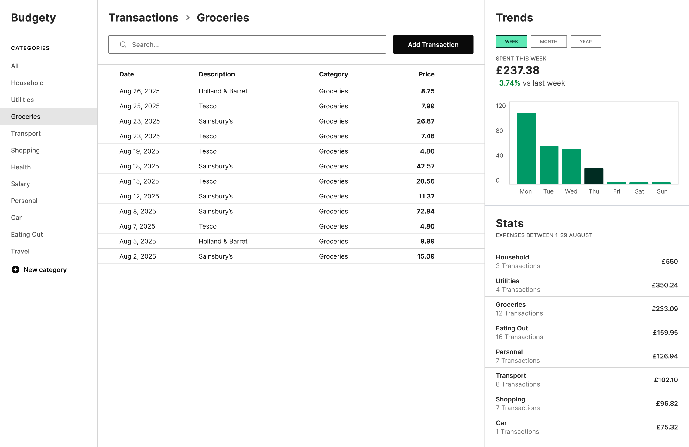
Budgety was a project I really enjoyed working on. I started my product design journey focusing on mobile design, so trying something different was fun. I stumbled with many different problems along the way, but I believe I was able to solve most of them with good results.

I specially enjoyed working on the trends graphs and the sidebar, which you can hide if you need it. Overall, the most difficult thing I worked on was the main table, where you can see the latest expenses you previously added to the app. I found out it's important to work with contrast and font weight in order to make the most important data (the amount) stand out in some way.

Made with Eleventy and Tailwind CSS. Powered by Netlify.

© 2025 Sergio Asenjo