Designing a real estate app from scratch
UX/UI Design
Once I had learnt the basics of Figma, I decided it was finally time to start working on my first proper project. Since I've moved houses quite a few times and I've spent so much time looking for apartments using different apps and websites, I thought it would be cool to build my own real estate app. Here you can read more about the process.
Process and experience
Sitting in front of a blank canvas to start working on an user interface is hard. You have endless possibilities, but the absence of constraints can get in the way of creativity. That's why I believe it's better to start working on a blank piece of paper and draw some quick sketches before opening Figma. Knowing what features the app should have before you jump onto Figma is also useful.
For this project, I decided users should be able to search for properties and use filters to limit the amount of results shown in screen, as well as having a way to message landlords so they can ask questions. Those were going to be the app main features. I draw a few quick sketches to test what kind of layout would suit the app better and after a while and I was finally ready to open Figma and start playing with real pixels.
Building a design system
Before I started working on this project, I was determined to design an app following the same steps a real team would. That's why I didn't settle for just designing the app different screens. I wanted to build a design system with every single element: typography, buttons, icons, cards and so on. That way I could also make use of features such as Text Styles, Color Styles and Effect Styles and apply changes at once at any step of the process.
Building a design system was challenging, but it helped me value its potential. Having a system you can easily come back to at anytime (even weeks or months after working on a project) to easily apply the desired changes feels like magic.
Outcome
The app you see on my portfolio is the final version of the project. As you can imagine, I've spent many hours iterating until I was happy with every screen of the app. Having said that, let's see how the app main features work and some of my thoughts behind them.
Search
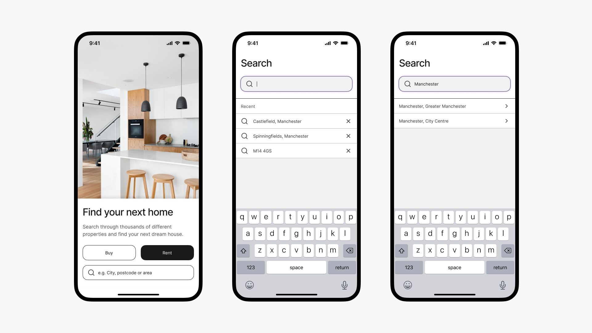
The search section is the first screen users see every time they open the app. It was important to get it right and I ended up spending more time than I wanted working on this screen. Even thought it seems quite minimal, it's hard to design something straightforward and easy to use while maintaining the overall app aesthetics. I had to iterate for a while to get it right, but I'm happy with the results.
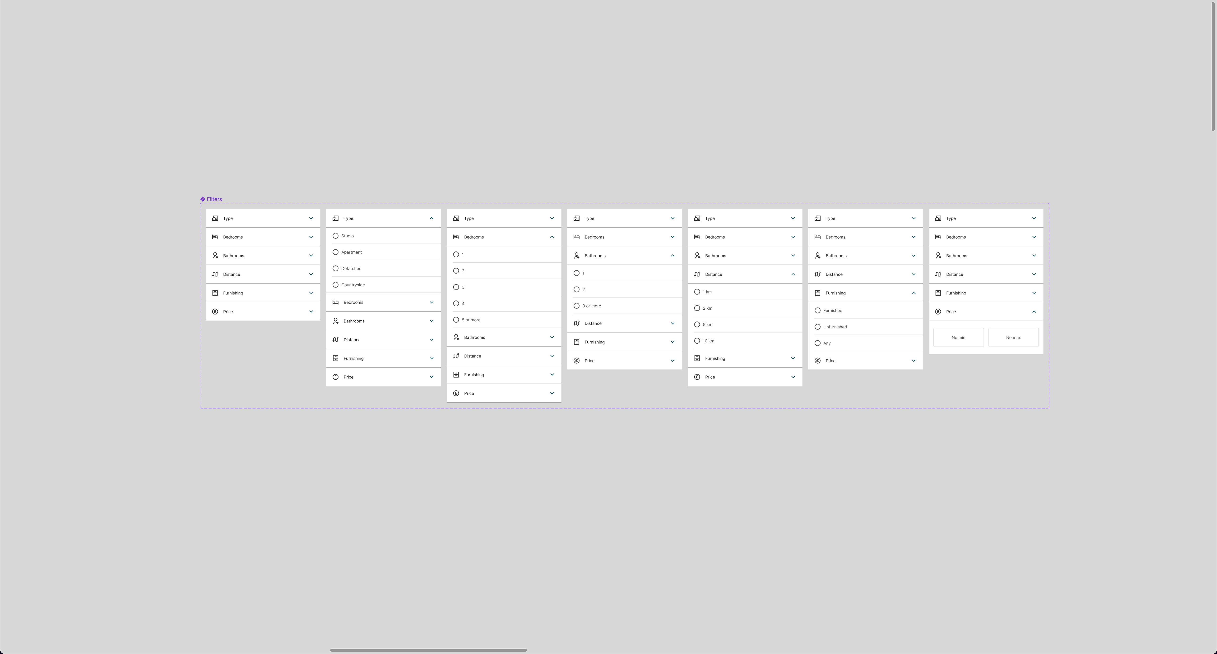
Filters
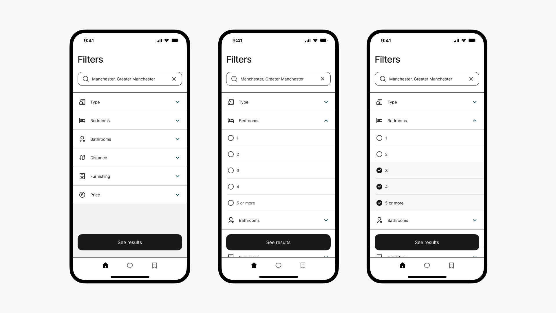
Here users are able to easily apply filters for property type, number of bedrooms and bathrooms, distance from city centre, furnishing options and monthly price. Of course, they're also able to skip filtering at all. I really enjoyed playing with interactive components in order to achieve a working prototype of the filter screen.
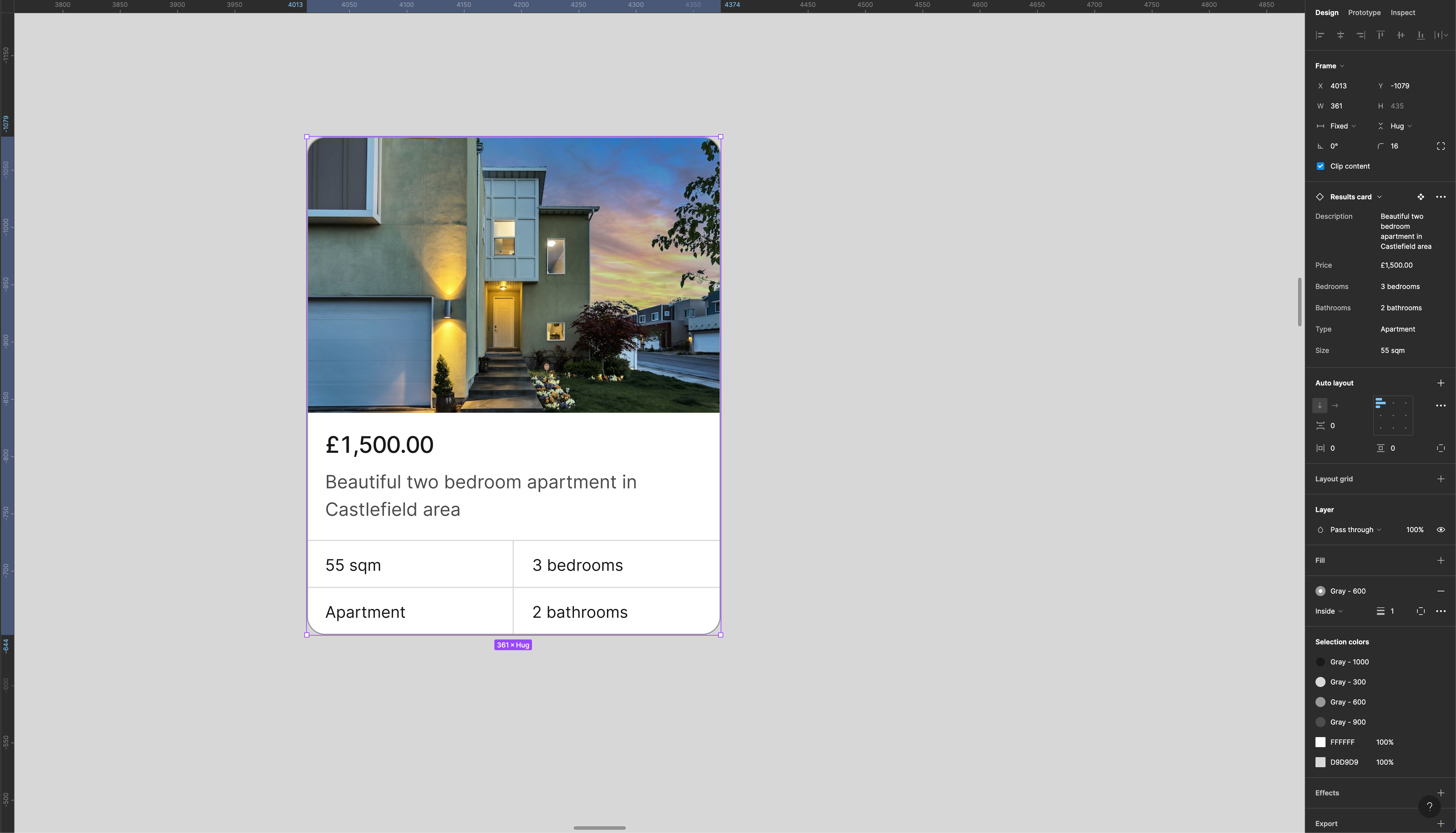
Results and property details
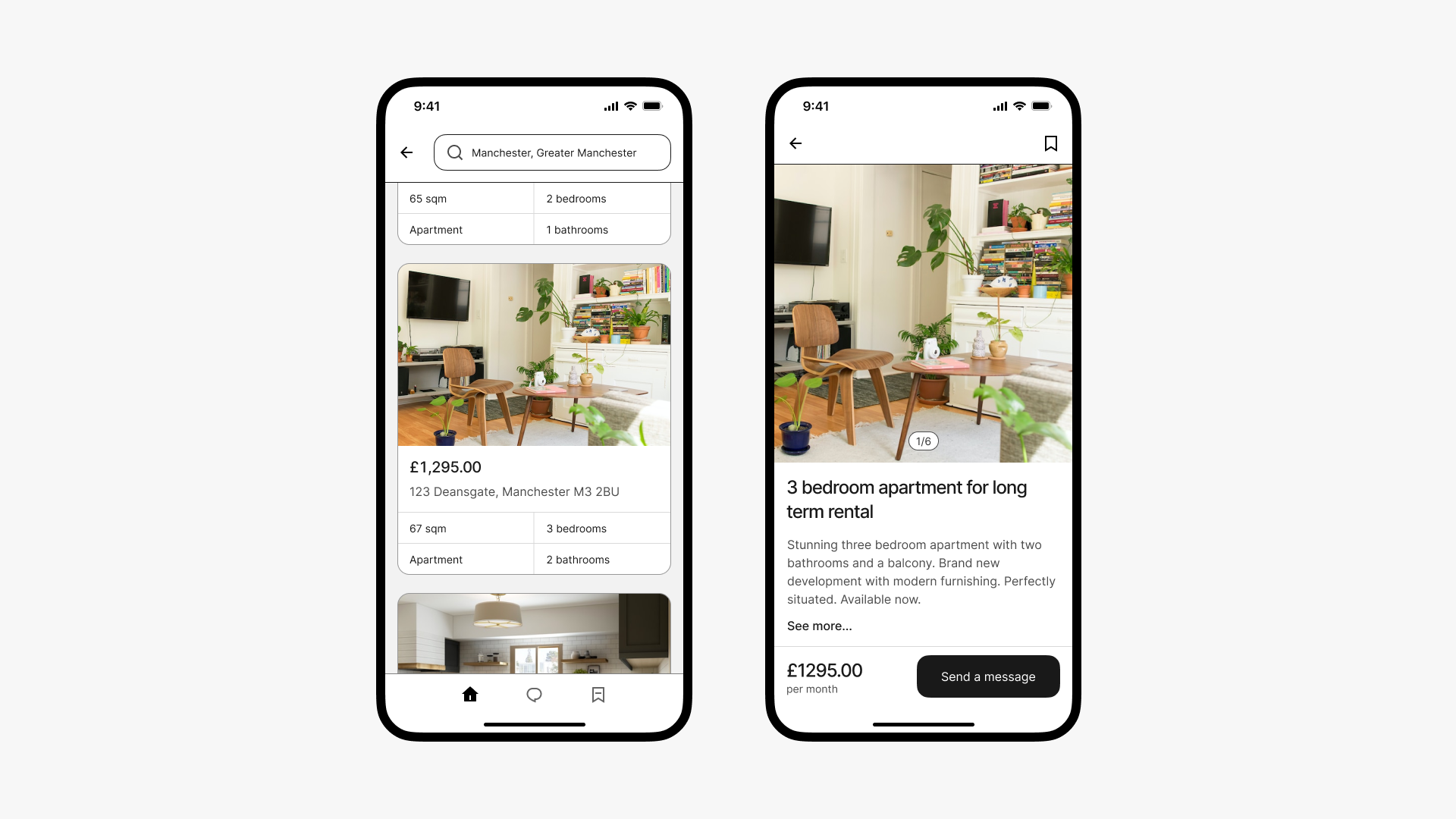
Once filters are applied, the app will show the relevant results. Every property is shown in a card with the most important information, like the monthly price or the address. If you tap on the card you'll go into the property details view, where you can get to know more about the apartment and get in touch with the landlord.
Messaging
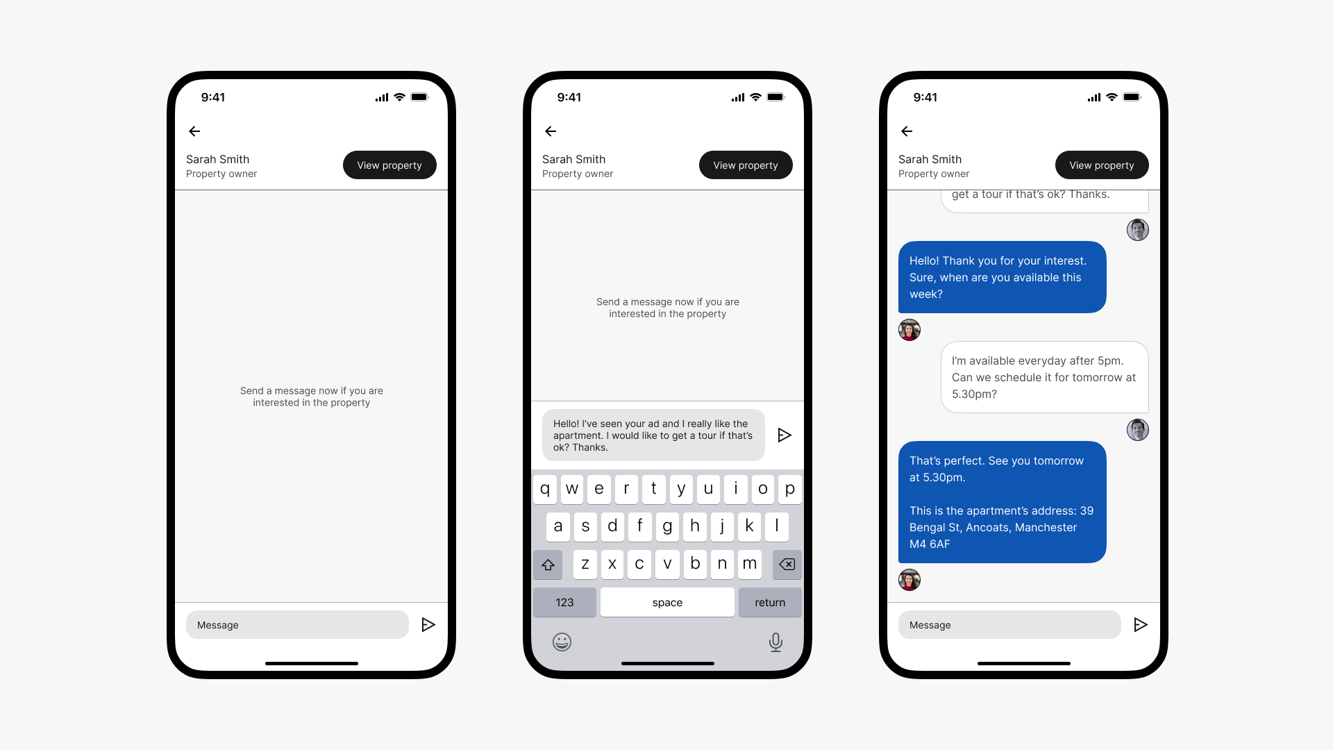
Once the user taps on the 'Send a message' button, they will jump onto the built-in messaging tool. When users are looking for a new home they may send dozens of messages to different landlords, so it may be hard to remember which apartment owner they're talking to once they get a reply. If the user doesn't remember the apartment, they can tap on the 'View property' button to go the property details view.
Learnings
This project helped my value the importance of building a design system early on. Even-though it is a small project if we compare it to a real app, I realized how useful a design system is when I was playing with font sizes and colors, as well as making changes to the UI. Tring to achieve a common aesthetic between the different screens was also difficult at moments, but after a few iterations I was quite happy with the results.